5 Color Palettes That Capture the Creepycore Aesthetic Without Going Gothic
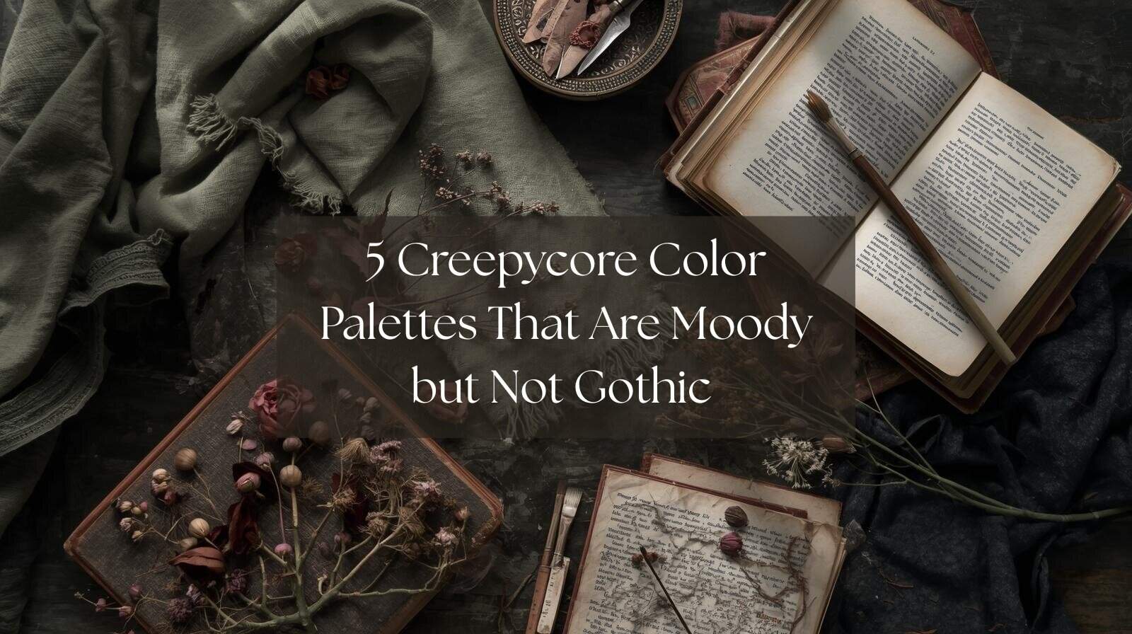
Creepycore is one of those aesthetics that’s hard to define but easy to feel. It’s eerie and nostalgic, like finding an old photograph tucked inside a library book or wandering through an abandoned greenhouse at dusk. It leans into the strange and the sentimental, mixing soft decay with a quiet kind of beauty.
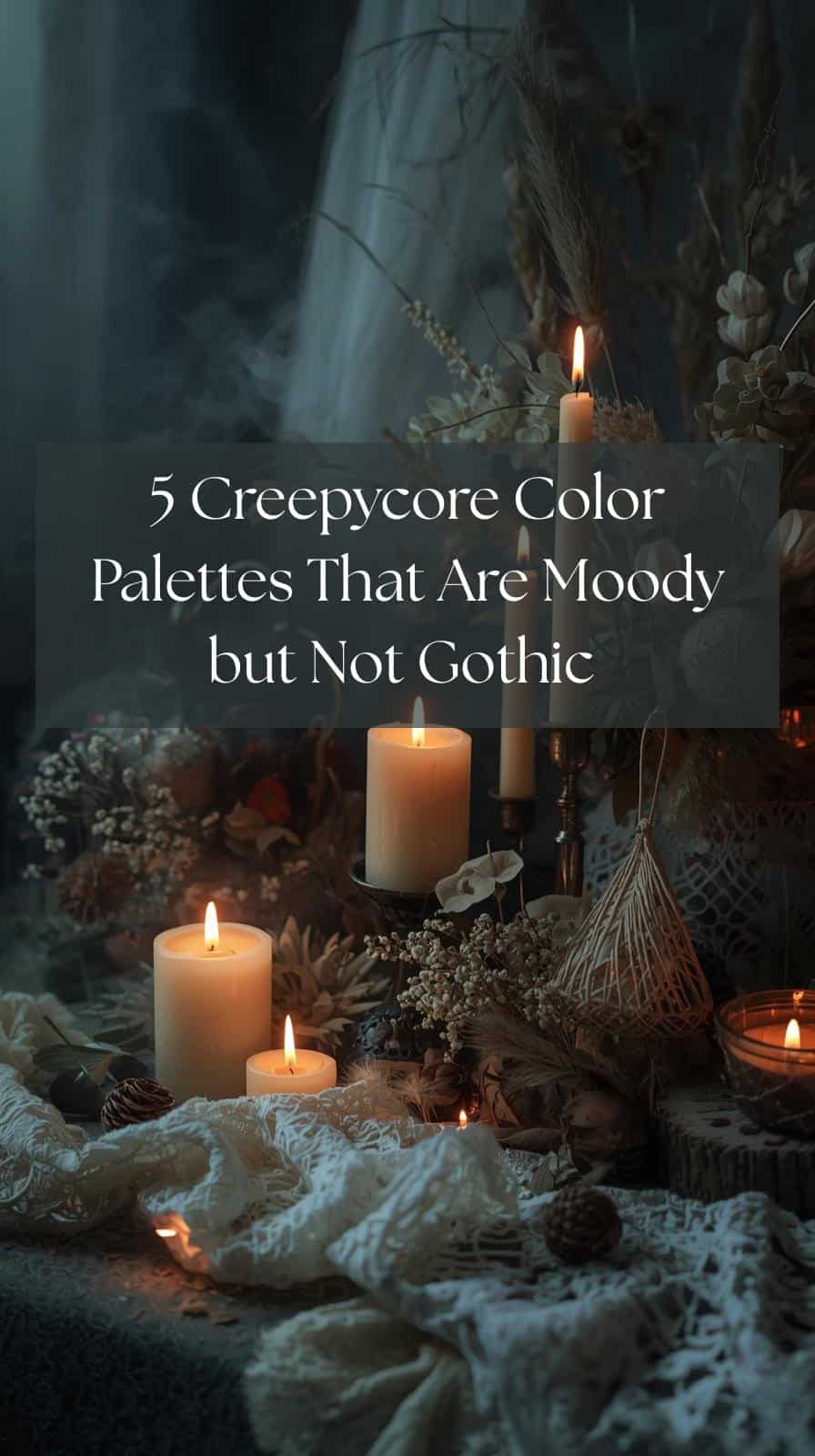
But creepycore doesn’t have to mean full-on gothic. You can capture that haunted, moody atmosphere without turning everything pitch black. It’s all about the colors you choose, the ones that whisper rather than scream.
Here are five color palettes that balance the unsettling and the soft, perfect for anyone who loves the spooky side of cozy.
1. Muted Moss + Dusty Rose + Charcoal
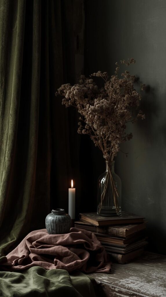
This palette feels like an overgrown garden left to rest. The soft green of moss pairs beautifully with the faded romance of dusty rose, while charcoal adds just enough depth to keep things grounded. It’s delicate, slightly decayed, and quietly haunting in the best way.
Use this mix for a moody floral arrangement, vintage-inspired artwork, or soft furnishings like velvet cushions and worn linen. It creates that forgotten-parlor energy that feels both lived-in and a little mysterious.
What makes this palette so perfectly creepycore is the balance. The colors aren’t harsh or heavy, but they still carry that sense of slow, beautiful decay that defines the aesthetic.
2. Sepia + Burnt Orange + Ash Gray
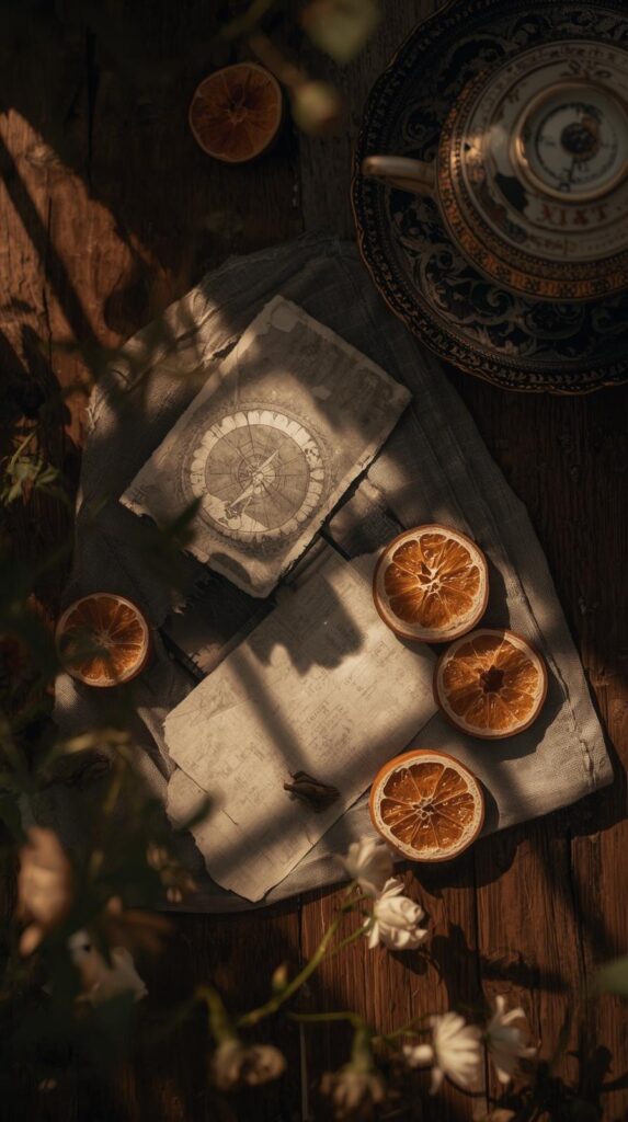
This palette feels like a forgotten photograph from the 1920s, slightly faded around the edges but full of warmth. The sepia and burnt orange bring in a sense of vintage comfort, while ash gray gives it that eerie calm. Together, they tell a story of time and memory.
It’s a great mix for anyone drawn to old film aesthetics, thrifted finds, or antique decor. Think flickering candlelight against weathered wood or dried leaves in a ceramic vase. The warmth keeps it from feeling cold, yet the gray softens everything enough to keep it mysterious.
This palette captures the nostalgic side of creepycore, where coziness and unease share the same space.
3. Sage Green + Bone White + Dust Brown
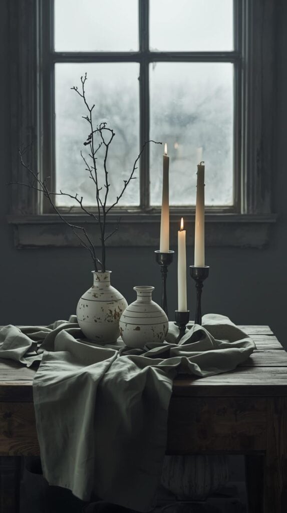
Soft and natural, this palette is perfect for those who like their spooky with a touch of calm. Sage green brings the grounding energy of nature, bone white adds a ghostly stillness, and dust brown gives it that aged, earthy tone that feels timeless.
It works beautifully in minimal interiors or handmade crafts. Try it for ceramic pieces, textured linens, or painted furniture that feels like it has a story. The overall look is quiet but filled with presence, like the air before a storm.
This color trio shows that creepycore doesn’t need to shout. Sometimes, it’s the hush that makes it powerful.
4. Mauve + Olive + Rust
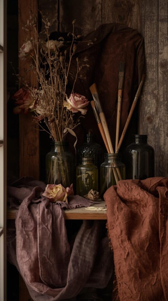
This palette feels like wilted flowers and cracked paint in an old manor. Mauve adds a soft melancholy, olive brings depth, and rust gives it life. Together they create something hauntingly pretty, full of faded charm and emotional warmth.
Use it for textiles, wallpaper, or small decorative pieces that look better with age. It’s especially lovely in autumn when natural light brings out the richness in each tone.
This one leans into the romantic side of creepycore, where decay and beauty are intertwined in a way that feels oddly comforting.
5. Smoky Blue + Lavender Gray + Pewter
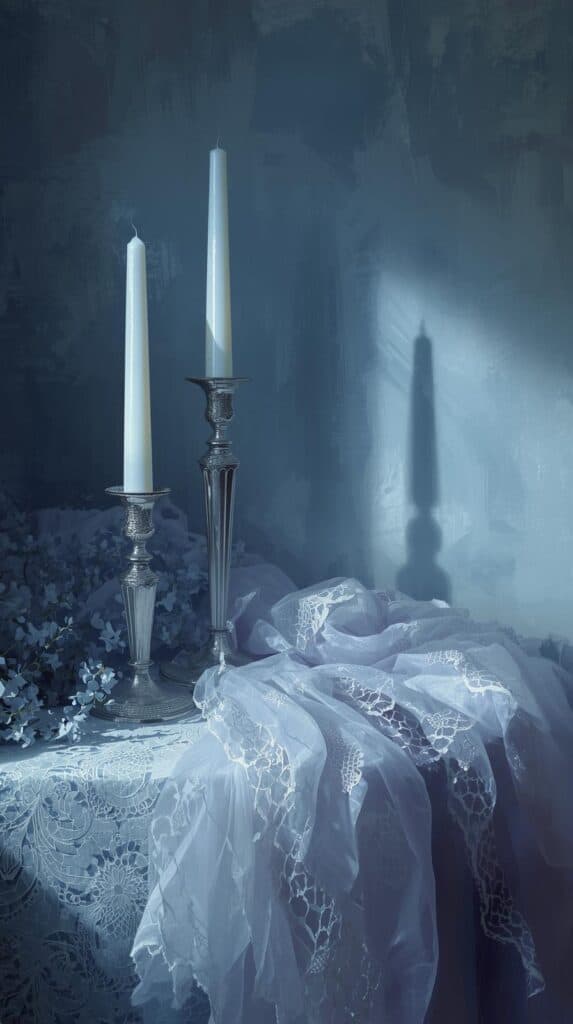
Soft, misty, and dreamlike, this palette feels like twilight just before the stars appear. Smoky blue anchors the mood, lavender gray softens it, and pewter adds a metallic touch that hints at something otherworldly.
This combination works for cool-toned rooms, digital art, or fashion pieces that balance elegance with eeriness. Think silk ribbons, foggy landscapes, or weathered silver frames.
It’s a palette that captures the emotional quiet of creepycore without leaning too dark. Peaceful, strange, and beautifully unsettling.
Conclusion
Creepycore thrives in the in-between. It’s not about horror or gloom but about finding beauty in what’s faded and strange. These palettes show that you can build that atmosphere through color alone, layering warmth and depth until it feels just a little uncanny.
Experiment with textures, lighting, and contrast until you find your version of eerie comfort. After all, the charm of creepycore lies in the details—the way something imperfect can still feel alive.

